
HSBC
Fraud
Warning
The world of fraud is changing at a rapid rate and even more so as technology opens more doors for new scamming methods. I was asked to work on HSBCs present and future of fraud warning.
I consider this my most important project to date.
Protecting the most vulnerable
Scammers literally do not care as long as they get their money, they will target any person, no matter the customer circumstances; elderly, disabled, depressed, people in problem debt. Everyone is a target and nobody is off limits.


Financial difficulty and suicide
Researching into people in financial difficulty there was a reported link. People who get into financial difficulty are more likely to think about suicide which can lead to taking action if left unchecked.
3X
More likely to think about suicide when in problem debt
420K
People in problem debt
who think about suicide
100K
People in problem debt
that attempt suicide per year

Two problems going hand in hand
Problem 1
(suspicious transactions)
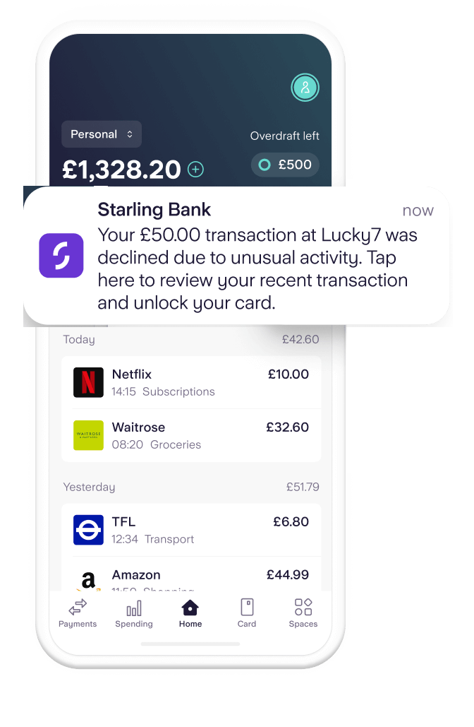
55% of customers ignored push notifications related to suspicious transactions. This lack of engagement posed risks to both customers and the business. Possible causes:
Mistrust in notification authenticity
Waiting for second SMS communication before acting
Making a decision at the point of notification and dismissing it
The goal was to improve customer trust and engagement at the time of approving or reporting a transaction.
Problem 2
(paying someone)
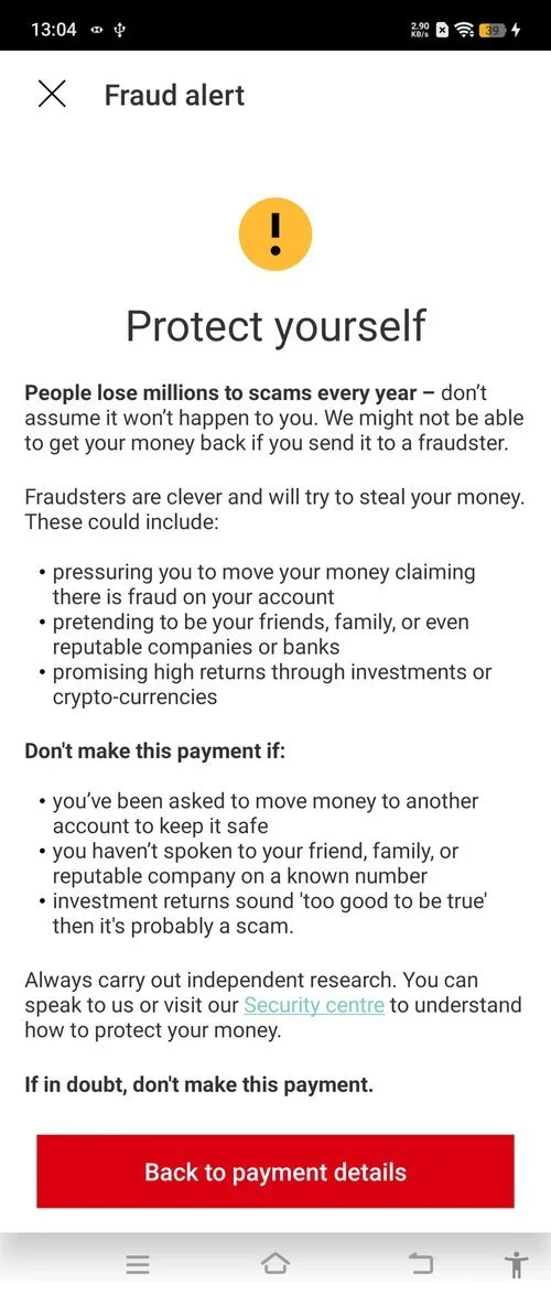
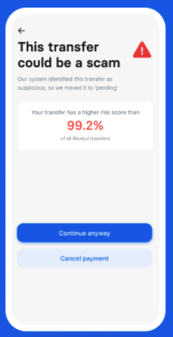
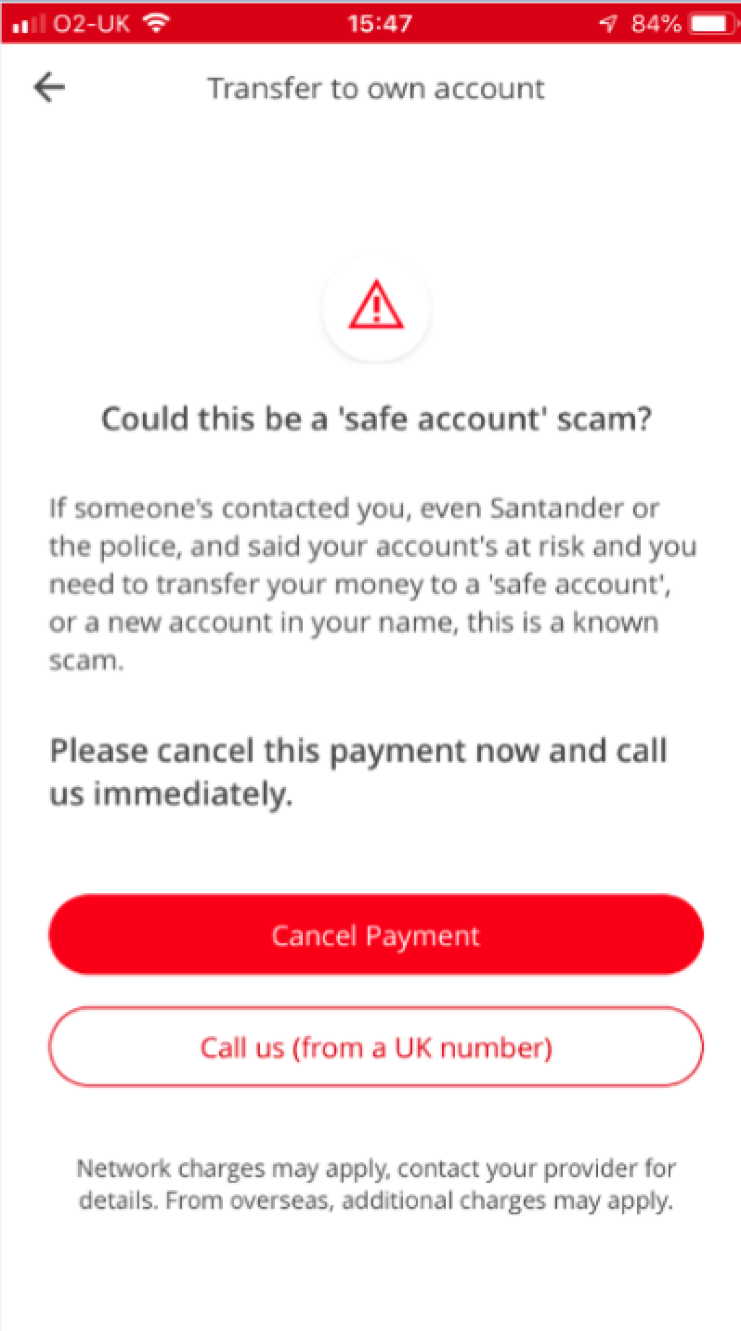
Current scam warnings in HSBC’s payment journey often fail to influence user behaviour. Research shows they’re unclear, poorly timed, and easily dismissed.
Users misinterpret warnings as technical issues
Messages lack urgency or actionable advice
Fraudsters can override weak warnings in emotional situations
A more effective warning must interrupt high-risk payments with clarity, empathy, and stronger behavioural cues.
First thing first:
Tackle problem 1
Our first issue was to tackle the engagement how we communicated from outside the app and leading into the app initially, then we could look at the follow up issues. We felt our learnings here would feed into the second larger problem.
Customer Journey Mapping
Using FigJam we conducted customer journey mapping sessions in group workshops involving staff from fraud, tech and UX. This meant we could map out all journeys that weren’t covered already and all the different scenarios across the multiple touch points, plus along the way consider the tech constraints that we also needed to work around for now and what improvements we can consider.
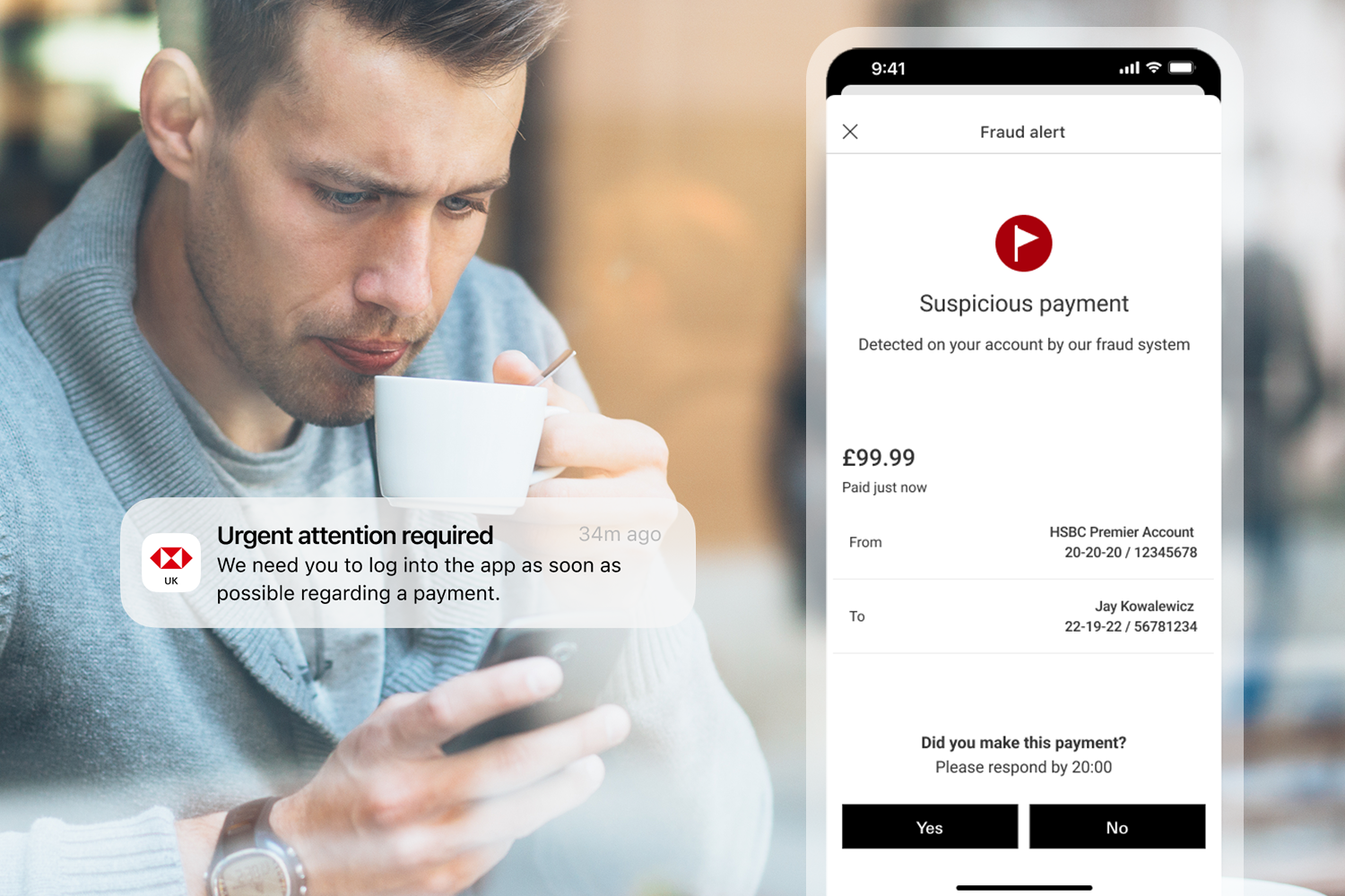
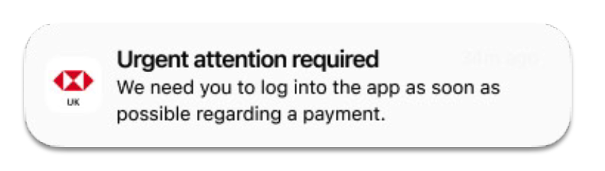
Customers didn’t trust our own messages
One of the key things I identified with earlier research is that the current notifications held a lot of information and may also be written in a way where it actually in itself sounds like a scam and not trusted to be interacted with by the customer at first glance.
CURRENT
Notifications contained too much information
Wording made messages feel like scams themselves
Dismissed or decided all okay outside the app
Without feedback fraud team had no option but to escalate
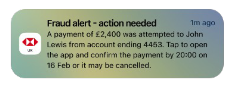
NEW & SIMPLIFIED
Simplified for reduced cognitive load
Concentrated on getting the customer into the app (safe space)
Once inside the app the info can be trusted with more space to explain
Tone was calm but conveyed urgency on needing feedback
Base in place:
Time for problem 2
Our first issue was to tackle the engagement how we communicated from outside the app and leading into the app initially, then we could look at the follow up issues as our learnings would feed into the second larger problem.
Research
There was plenty to consume and cross reference in terms of general fraud information and how the bank had approached this in the past, they had been tested by the bank. The banks approach had been also adopted by many banks.
Current HSBC Journey
Current journey was very static, text heavy and relied on customer input for gathering information on the payment to then give feedback with advice. It was hard for the bank to get the correct message across but also protect itself from not giving the legally required information
Competitors
Looking around at the competitors a lot of banking institutions have similar approaches to informing the customer what to do.


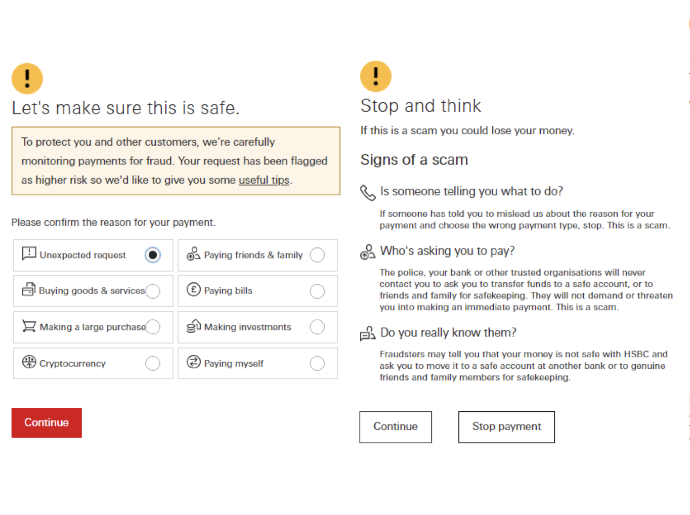
Overused icons
Icon blindness
The bank were using the rag status icons for a lot of different scenarios and mainly around technical issues were the customer was hindered or needed to retry, in other cases the technical issue was a blocker and so a red triangle was used. However the customer seen these icons many times over the years and in many circumstances where the situation wasn’t as critical as a fraud warning is.
CURRENT
Error and delay icons
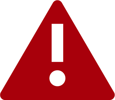

Current icons were overused for all sorts of mixed scenarios
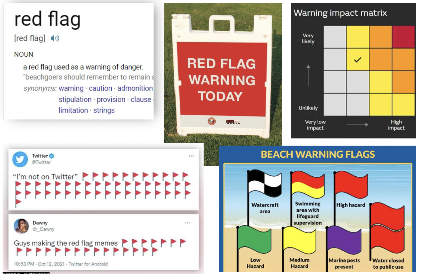
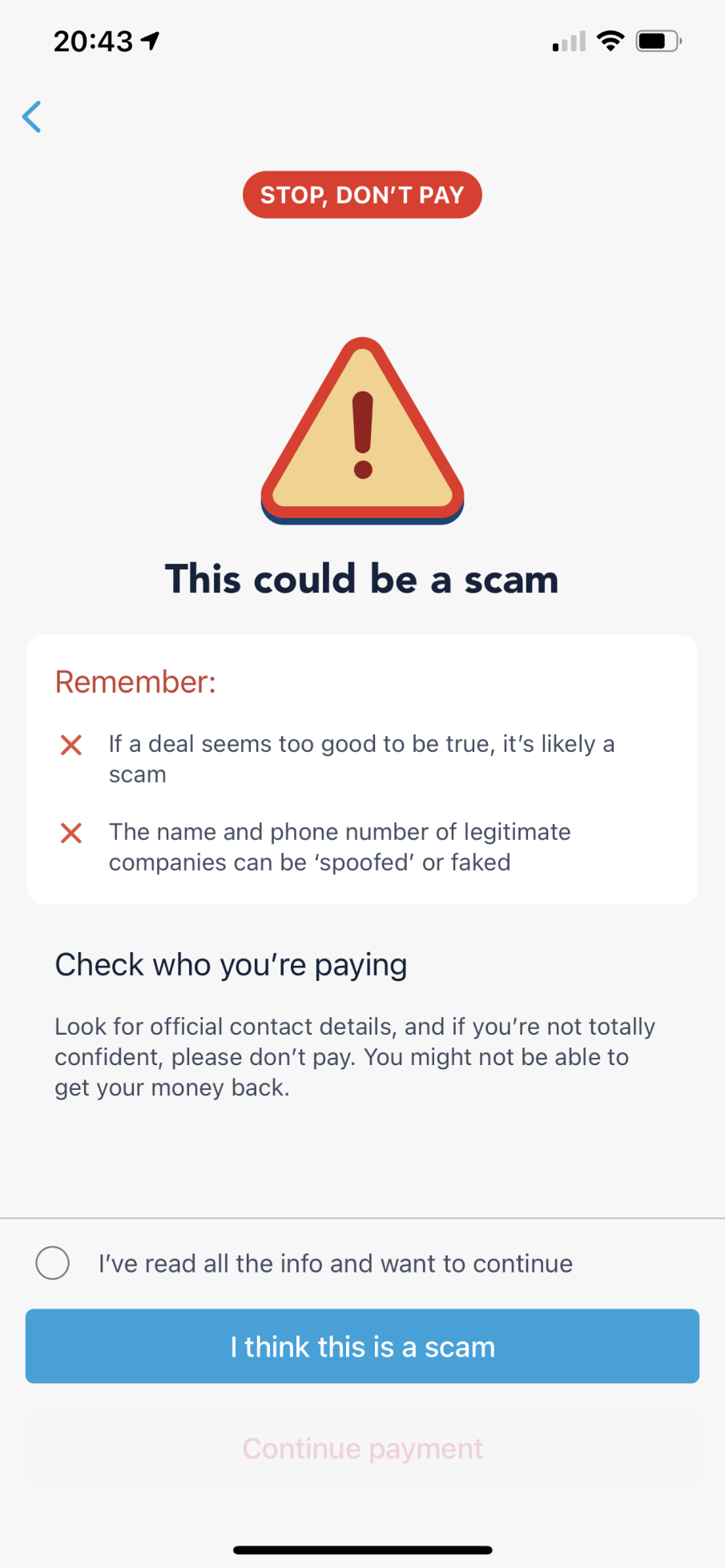
Red Flag
A dedicated symbol for Fraud
My concept was that we needed a symbol dedicated to fraud prevention and that is only seen when the bank talks about the risk of customers money or information around scamming. A red flag is a familiar symbol of danger and built into culture as a warning.

This icon would give us the the correct iconography for the appropriate response, even if it was actually a white flag on a red background! This construction however gave it more impact.